
Want to make your data presentations unforgettable? Mastering data storytelling is the key. Numbers alone rarely inspire action, but when paired with a clear narrative and visuals, they become powerful tools for decision-making.
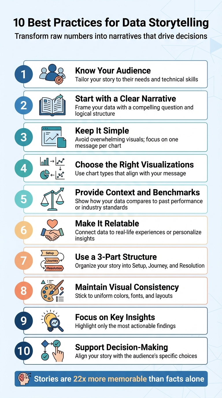
Here are the 10 best practices for effective data storytelling:
- Know Your Audience: Tailor your story to their needs and technical skills.
- Start with a Clear Narrative: Frame your data with a compelling question and logical structure.
- Keep It Simple: Avoid overwhelming visuals; focus on one message per chart.
- Choose the Right Visualizations: Use chart types that align with your message (e.g., bar charts for comparisons, line charts for trends).
- Provide Context and Benchmarks: Show how your data compares to past performance or industry standards.
- Make It Relatable: Connect data to real-life experiences or personalize insights.
- Use a 3-Part Structure: Organize your story into Setup, Journey, and Resolution.
- Maintain Visual Consistency: Stick to uniform colors, fonts, and layouts.
- Focus on Key Insights: Highlight only the most actionable findings.
- Support Decision-Making: Align your story with the audience’s specific choices.
Why this matters: Stories activate multiple areas of the brain, making insights easier to remember and act upon. By following these practices, you’ll transform raw numbers into narratives that transform your website that guide decisions and drive results.
10 Best Practices for Effective Data Storytelling
Data Storytelling: Best Practice
sbb-itb-7a4ada9
1. Know Your Audience
Before diving into charts or crafting narratives, take a moment to clearly define your audience. This isn’t about making assumptions – it’s about digging deeper and asking critical questions: What challenges are they facing? What obstacles are stopping them from overcoming those challenges? What insights have they been unable to uncover from the data so far?
Once you’ve identified your audience, shape your approach to meet their specific needs. Their role determines everything – from how detailed your visuals should be to the complexity of the information presented. For example:
- Strategic decision-makers who review financial performance quarterly need concise, high-level summaries they can grasp quickly.
- Operational managers, involved in daily decisions like uptime or quality control, require clear, actionable indicators.
- Tactical teams, such as those analyzing weekly sales funnels, benefit most from interactive dashboards that let them explore trends and dig into the specifics.
Different groups call for different levels of detail and visualization styles. Tailor your presentation accordingly.
"Understand the context. Know who your audience is and what they care about. Ask yourself: What do they need to know, and what action should they take?" – Cole Nussbaumer Knaflic, Author of Storytelling with Data
Finally, keep your audience’s technical skills in mind. If they find your chart difficult to interpret, simplify it further. The goal is to make the data accessible, not overwhelming.
2. Start with a Clear Narrative
When presenting data, keep this in mind: without a story, data is just a collection of numbers. A strong narrative transforms those numbers into something meaningful, sparking emotional connections and making the insights stick.
Once you’ve identified your audience, focus on creating a storyline that directly addresses their concerns. Think of this narrative as the link between the raw data and its significance to your audience. Start by posing a central question – like "Why did sales drop in Q3?" or "What’s causing customer churn?" – to give your analysis direction and prevent it from veering into irrelevant details.
Organize your analysis into three key stages: Setup (what’s happening), Insight (what the data reveals), and Action (what steps to take next). This structure ensures your audience follows a logical path, rather than being overwhelmed by scattered facts. Use visuals strategically, arranging them so each one builds on the last, reinforcing your message step by step.
To take it further, apply the "So What?" framework to every metric. Decision-makers don’t need a flood of numbers – they need to understand what those numbers mean and what actions to take. For example, instead of just stating "conversions dropped 14%", explain why: "Conversions dropped 14% due to a shift in paid traffic quality." This approach shifts your presentation from mere reporting to impactful storytelling. It’s all about turning data into decisions.
3. Keep It Simple
When it comes to data, simplicity is key. Your audience doesn’t need to see every single data point – they need to understand what matters most and why it matters. Clear, straightforward insights are what drive decisions, not overwhelming complexity.
Visuals that are simple and focused grab attention immediately. Decision-makers form impressions in seconds, so your visualizations need to communicate their message without confusion. As Rohit Sharma, Head of Revenue & Programs at upGrad, aptly states:
"If your audience needs a guide to read your graph, it’s not doing its job."
Packing too much information into a single visual or presenting multiple charts at once can overwhelm and disengage your audience. Instead, stick to the "one chart = one message" rule. Each chart should focus on delivering a single, clear takeaway. For instance, if you’re illustrating a revenue decline, keep the chart focused on that trend alone. Avoid combining it with unrelated details like customer demographics or regional data. Simplify the design, strip out unnecessary elements, and use colors sparingly to highlight the most critical points.
Hannah Worsham, Business Intelligence Consultant at RXA@OneMagnify, emphasizes this idea:
"Data dashboards that drive decisions don’t have to be fancy or complicated."
Familiar chart types like bar graphs and line charts are your best friends. They’re easy to understand and ensure your audience spends their time focusing on the insight, not trying to decode the visualization. If a chart and a single sentence can convey your message, there’s no need to add extra layers of detail.
As Beautiful.ai puts it:
"Data visualization that works is not about showing more. It is about communicating what matters."
Keep it simple, and your message will stand out.
4. Choose the Right Visualizations
Selecting the right chart is a game-changer when it comes to telling a compelling data story. As UpMetrics aptly states:
"Choosing the wrong chart undermines your story."
The type of chart you use should align with the message you’re trying to convey. For instance, if you’re showcasing revenue growth over a year, a line chart effectively highlights trends. On the other hand, if you’re comparing sales across regions, a bar chart makes it easy to spot the top performers.
Why does this matter? Visual data is processed up to 60,000 times faster than text. That’s a huge opportunity to make your insights stick. The key is pairing your data with the best format to ensure clarity and impact.
Here’s a quick guide to matching charts with your goals:
- Bar or column charts: Ideal for comparisons.
- Line charts: Perfect for trends over time.
- Pie or donut charts: Best for showing part-to-whole relationships, but only when there are a few categories.
If you’re analyzing distributions or outliers, opt for histograms or scatterplots, as they can reveal patterns that tables might miss. For showcasing relationships between variables, scatterplots and heat maps are excellent choices. And when location matters, maps are unbeatable. For example, in June 2025, Oxfam Ireland used geospatial visualizations in their annual report to map relief efforts across 27 countries. This approach gave stakeholders an instant understanding of their global impact, far more effectively than a simple list of locations.
It’s also crucial to consider your audience. General audiences find bar and line charts intuitive, while more complex visuals like radar charts or alluvial diagrams work better for expert users. If stakeholders need precise values, stick with a table instead of a chart.
Lastly, a couple of practical tips: Always start bar chart baselines at zero to avoid misleading viewers. And if you’re using bars, sort them by size to make patterns jump out immediately. These small adjustments can make a big difference in how your data is received.
5. Provide Context and Benchmarks
Numbers on their own can feel like empty figures without the right context. Data scientist Michal Szudejko puts it perfectly:
"Context is a critical component in data-driven storytelling and, in my opinion, accounts for 80% of the story’s success."
Simply put, raw data doesn’t inherently tell you if the results are good, bad, or worth acting on. Context is what turns those numbers into something meaningful, giving them purpose and clarity.
For example, imagine reporting a 14% increase in sales. That might sound decent at first glance. But if you add that it’s the highest growth rate your industry has seen in 20 years, the narrative shifts completely. Context, through benchmarks and comparisons, provides a sense of scale and significance. Without it, numbers exist in isolation, leaving room for misinterpretation and confusion.
A standout illustration of this comes from a public health study conducted in AnyCity, USA. Researchers initially presented a bar chart showing hepatitis rates rising between 2000 and 2020. On its own, the chart was informative but lacked depth. When they layered in historical data from the 1980s, a critical insight emerged: the sharp increase began around 2010. By tying this trend to the opioid crisis and comparing AnyCity’s rates with state and national averages, the researchers transformed a simple chart into a powerful argument for increased funding and resources.
Always aim to explain why a metric matters. If you’re showing a 12% drop in web conversions, don’t stop at the number. Compare it to previous quarters, last year’s data, or industry standards. Is this a seasonal fluctuation or a warning sign? These comparisons are what keep your audience engaged and informed.
Transparency is key too. Clearly explain how the data was collected and cleaned. This openness builds trust and minimizes doubt, which can otherwise undermine even the strongest data-driven narratives. When stakeholders understand the reasoning behind your numbers, they’re more likely to connect with your insights and act on them. Context doesn’t just clarify – it sets the foundation for stories that resonate.
6. Make It Relatable
When it comes to data, making it feel personal is the secret to grabbing attention. Abstract numbers and facts rarely stick unless people can see how they connect to their own lives. The trick is turning raw data into stories that resonate with everyday experiences. When data feels personal, it becomes more than just information – it becomes meaningful.
One effective way to do this is through localizing the story with digital marketing services. Take the BBC’s "How climate change could hit your city" campaign, for example. Instead of overwhelming viewers with global climate stats, they zoomed in on how climate change might impact specific cities. By focusing on local effects, they transformed a massive, abstract issue into something tangible and relevant to people’s neighborhoods and daily lives.
Another strategy is personalization. Think about Spotify Wrapped or Myntra’s trend reports. These platforms take user data – like listening habits or shopping preferences – and turn it into personalized summaries. It’s not just about the numbers; it’s about making users feel seen and turning their data into a narrative that reflects their unique journey.
Data also becomes relatable when you translate large, abstract figures into something familiar. For instance, instead of saying "people produce a lot of content", specifying "2.5 quintillion bytes daily" (or 2.5 billion gigabytes) makes the scale easier to grasp. Airbnb takes this concept further by showing homeowners exactly how much they could earn based on local market data. Suddenly, abstract statistics become real dollars that people can picture in their bank accounts.
Emotional connection is just as important as logical understanding. As Rohit Sharma from upGrad explains:
"Data Storytelling is the bridge between data and understanding. It’s the difference between a report that gets ignored and a message that sparks action".
When you engage your audience emotionally and logically, they don’t just process the data – they feel it, remember it, and are more likely to act on it.
7. Use a 3-Part Structure
When presenting data, a clear structure can make all the difference. A 3-part structure – Setup, Journey, and Resolution – helps guide your audience step by step, aligning with how people naturally process information. This method works with human psychology to make your story both engaging and effective.
Act 1: The Setup
Start with a strong opening that grabs attention and establishes why your audience should care. For instance, instead of a bland "Here’s our quarterly data", try something like, "We’re losing $2 million per month, and I think I know why." This kind of hook sets the stage for what’s to come and gives your audience a reason to stay invested.
Act 2: The Journey
This is where you unfold your data, bit by bit, like a mystery. Avoid overwhelming your audience with all the information at once. Instead, let each piece of data answer one question while raising another. For example, rather than simply stating, "Sales were $2M in Q1," you could say, "After a strong Q1, the pricing change in April caused a 30% drop." This approach keeps your audience engaged and eager to see what comes next.
Act 3: The Resolution
End with a clear and satisfying conclusion – your "aha moment." This is where everything comes together, and you provide actionable recommendations based on the evidence you’ve presented. Include specific next steps to leave your audience with clarity and direction. As Michael Torres, a data journalism instructor, explains:
"The difference between forgettable presentations and memorable ones… is whether there’s a story that takes the audience from confusion to clarity".
This structured storytelling approach doesn’t just make your data more digestible – it makes it impactful. Research shows that stories are up to 22 times more memorable than standalone facts. Plus, decision-makers are 40% more likely to agree with recommendations presented as part of a narrative rather than as isolated numbers. By turning raw data into a compelling story, you ensure your insights stick and drive action.
8. Maintain Visual Consistency
Visual consistency is key to making your data story easy to recognize and understand. The human brain naturally groups similar elements, so when your presentation uses consistent colors, fonts, and design elements, it aligns with how people process information. This approach helps your audience focus on the message, not the distractions.
Think of it as creating a "visual language" for your data. Stick to a palette of 3–5 colors, keep font sizes uniform for titles and labels, and use consistent chart styles. Avoid unnecessary distractions like shadows, 3D effects, or other design flourishes that can pull attention away from the insights you’re sharing.
The benefits are clear: data visualizations can increase dwell time on publications by 62%, and users are 317% more likely to scroll through a page with charts. However, poorly designed dashboards often fail because they’re too complex, with 53% of business leaders and data professionals finding them hard to interpret. Inconsistent design – like changing colors, fonts, or layouts – can overwhelm your audience and hinder their understanding.
To enhance clarity and maintain consistency, consider these tips:
- Assign specific meanings to colors so they’re used purposefully.
- Choose neutral backgrounds to make data colors stand out.
- Use plenty of white space to draw attention to key elements.
- Keep accessibility in mind: roughly 1 in 12 men has red-green color blindness, so pick high-contrast color palettes that work for everyone.
9. Focus on Key Insights
When presenting data, clarity beats quantity every time. One of the most common mistakes in data storytelling is overwhelming your audience with endless dashboards and figures – this is often called "data dumping". Instead, focus on guiding your audience to what truly matters. Every metric should pass the "So What?" test: What happened? Why is it important for the business? What action should follow? If a number doesn’t lead to an actionable insight, leave it out.
Start by defining a core question before diving into your analysis. For instance, asking, "Why are Q3 sales down despite increased traffic?" gives you a clear direction and helps you filter out irrelevant details. This method ensures your story stays focused. For example, identifying a 14% drop in web conversions is just a data point – it’s only meaningful when you connect it to a cause, like a decline in paid traffic quality, and pair it with actionable recommendations. By narrowing your focus, you can structure your insights more effectively.
As Jordan Turner, a writer and content strategist, puts it:
"Executives do not want more numbers; they want clarity on what those numbers mean and what decisions should follow."
To organize your insights, consider using the Pyramid Principle: start with your conclusion and back it up with two to four key insights. Decision-makers often form opinions quickly, so leading with your main point is far more impactful than building up to it. Another useful structure is the 1-3-1 Framework: one core idea, three supporting pieces of evidence, and one clear takeaway. This keeps your message concise and actionable.
When it comes to visuals, simplicity is key. Each visual should emphasize only one main point. If your audience needs help interpreting a chart, it’s time to simplify. Use elements like size, color, or position to highlight the most critical findings, while keeping supporting details in neutral tones. If you need to share granular details, avoid cluttering your primary visual. Instead, use drill-down options or separate tabs to provide additional context. This approach keeps your data presentation clean and easy to follow.
10. Support Decision-Making
Data storytelling isn’t just about presenting numbers – it’s about helping your audience make decisions. Every story you craft should align with the specific choices your audience is working through. Whether it’s strategic decisions like market expansion, operational tasks like daily quality checks, or tactical reviews such as monthly sales updates, each requires a different level of detail and focus.
Start by identifying the main decision at hand. Then, use the OIA Framework to structure your narrative: begin with observations, move to insights, and end with a clear action. This step-by-step approach keeps your message straightforward and actionable.
For operational decisions that happen often, simplicity is key. Visuals with binary options like "Approve" or "Deny" can speed up decision-making. On the other hand, tactical decisions – those made on a weekly or monthly basis – benefit from interactive tools like filters or drill-downs. These allow users to explore data layers and confirm critical insights. This mix of clarity and interactivity ensures your audience gets the guidance they need.
Experts agree: concise data storytelling turns static reports into actionable insights.
To take it a step further, always provide benchmarks and context. For example, saying "We generated $200,000 in profit" is informative, but adding " – 10x more than last year" makes it impactful. Context transforms raw figures into meaningful insights, giving your audience the confidence to act. Remember, they don’t need more data – they need clarity. By focusing on benchmarks and actionable insights, you make their decision-making process smoother and more effective.
Conclusion
Data storytelling turns raw numbers into meaningful narratives that inspire action. By following these 10 best practices, you can transform overlooked reports into impactful messages that drive decisions. When you tailor your story to your audience, simplify visuals, and provide the right context, you’re not just presenting data – you’re building trust and fostering understanding.
Research backs this up. Stories activate multiple areas of the brain, including regions tied to language, emotion, and empathy. This mental engagement makes insights stick and persuades more effectively than raw data ever could. These methods help you go beyond calculations to craft narratives that truly resonate.
Start by identifying the key question your data needs to answer, then structure your story around that decision point. Use clear and straightforward visuals, like bar or line charts, that are easy to interpret. Context is critical – benchmarking figures can make data more relatable. For example, noting that $200,000 in profit represents a 10× increase over last year makes the number far more impactful.
The need for professionals who can bridge the gap between data and decision-making is growing rapidly. Research analyst roles are expected to grow by 25% from 2020 to 2030. Whether you’re addressing executives or frontline teams, these practices ensure your insights are not only heard but acted upon at every level of your organization.
"The future belongs to those who don’t just know data – but who can tell its story." – Rohit Sharma, upGrad
FAQs
How do I find the one key message in my data?
When working with data, it’s essential to pinpoint the core insight that connects with your audience. Start by distilling your findings into a single, clear statement that emphasizes the most important patterns or trends. This should act as the backbone of your narrative.
Your key message needs to be memorable, simple, and directly tied to the takeaway you want your audience to grasp. By doing so, you can keep your storytelling focused and impactful, steering clear of unnecessary complications.
Which chart type should I use for my point?
The type of chart you choose should match the message you’re trying to convey. Bar charts are perfect for comparing different categories, making it easy to see differences at a glance. Line graphs excel at showcasing trends over time, helping to highlight patterns or changes. If you’re looking to display relationships or correlations between variables, scatter plots are the way to go. Begin with these options to create clear and impactful visuals.
How do I add benchmarks without cluttering slides?
To weave benchmarks into your slides without overcrowding them, try incorporating them subtly. Add small annotations or tuck them into a minimal space, like a footer or sidebar, to offer context without pulling attention away from your primary message. You can also use visual cues, such as icons or color coding, to make benchmarks easy to identify while keeping the design straightforward. This method ensures your slides stay clean and focused, all while reinforcing your data narrative effectively.