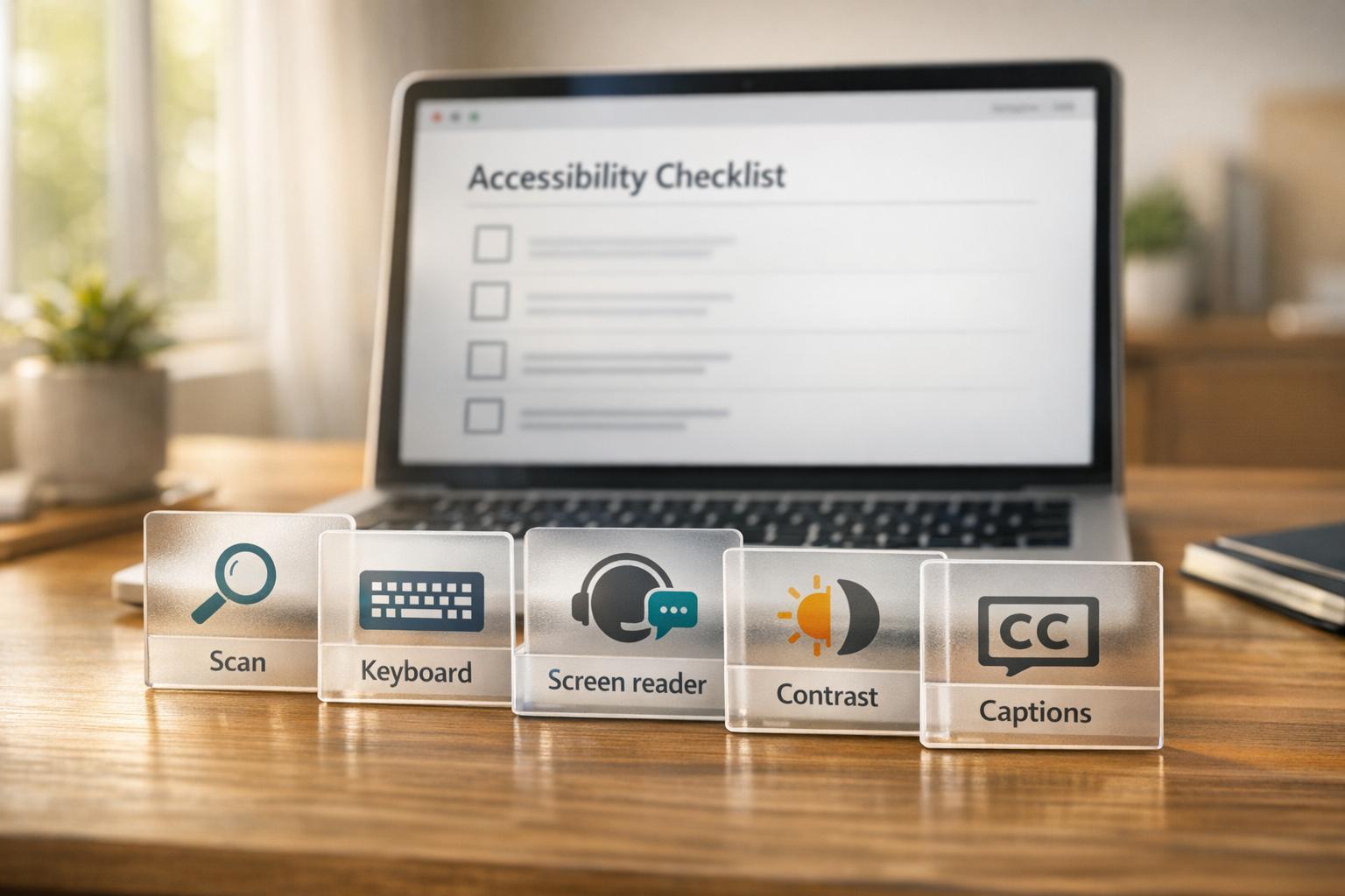
Website accessibility testing ensures your site works for everyone, including users with disabilities. It’s not just about compliance with guidelines like WCAG 2.1 or 2.2 – it improves usability, boosts engagement, and even enhances SEO. Automated tools like axe DevTools, WAVE, and Google Lighthouse can detect 30–40% of issues, but manual testing (e.g., keyboard navigation, screen readers) is critical for finding the rest.
Key Steps:
- Run Automated Scans: Use tools to identify basic issues like missing alt text or low contrast.
- Test Keyboard Navigation: Ensure all elements are accessible without a mouse.
- Use a Screen Reader: Simulate how visually impaired users experience your site.
- Check Color Contrast: Meet WCAG standards for readability and avoid relying solely on color.
- Verify Zoom and Responsive Design: Ensure content remains functional at 200% zoom.
- Review Media: Add captions and transcripts for videos and ensure interactive elements are accessible.
Accessibility is an ongoing process, but starting with these steps can help create a better experience for all users while reducing legal risks and improving site performance.
6-Step Website Accessibility Testing Process
How to manually test your website for accessibility
sbb-itb-7a4ada9
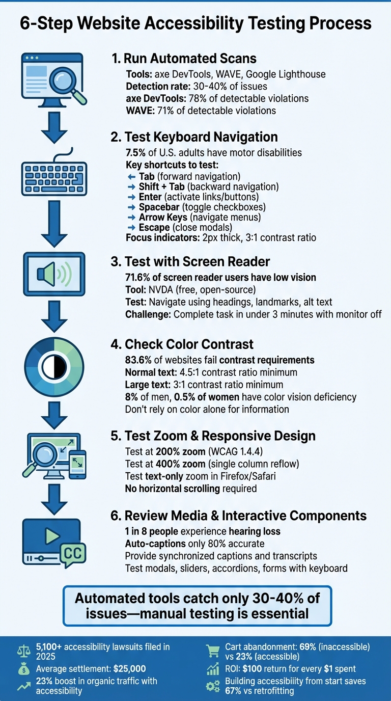
Step 1: Run Automated Accessibility Scans
Automated tools are a great place to start when evaluating your website’s accessibility. These tools check your site’s code against WCAG standards and flag issues that can be identified through programming. Common problems they catch include missing alt text, low color contrast, improper heading structures, and invalid ARIA attributes. While these scans don’t catch everything, they provide a solid foundation.
Some of the most widely used tools for this purpose are axe DevTools, WAVE, and Google Lighthouse. For instance, axe DevTools is highly reliable, as it flags only real issues. Its underlying axe-core library has been downloaded over 3 billion times and is even part of Google Lighthouse’s accessibility checks. WAVE, on the other hand, uses a visual overlay to mark errors (red icons) and alerts (yellow icons), making it especially useful for those without a development background. In a 2026 benchmark, axe DevTools identified 78% of detectable violations, while WAVE found 71%.
Here’s how you can get started with these tools.
Install and Set Up Accessibility Tools
Getting these tools up and running is quick and straightforward. To use axe DevTools, simply download the extension from the Chrome Web Store or Firefox Add-ons. Once installed, open your browser’s Developer Tools by pressing F12 or right-clicking anywhere on the page and selecting "Inspect", then navigate to the "axe DevTools" tab.
For WAVE, you can install its extension for Chrome, Firefox, or Edge, or use their online tool by entering your website’s URL directly on the WAVE site. Google Lighthouse, on the other hand, doesn’t require installation since it’s already built into Chrome DevTools. All three tools offer free versions with strong testing capabilities, making them accessible to everyone.
Once the tools are set up, you’re ready to start scanning your site.
Scan Important Pages on Your Website
Begin by focusing on your website’s most critical pages – those that are essential for user interactions. This includes the homepage, contact forms, login pages, search bars, and navigation menus. Instead of scanning every single page, prioritize unique templates. Fixing issues on these templates often resolves problems across multiple similar pages automatically.
In axe DevTools, click "Scan All" to produce a report that categorizes issues by severity: Critical, Serious, Moderate, and Minor. Start with Critical issues, as these often prevent users from completing tasks or violate WCAG Level A standards. For WAVE, click its toolbar icon to run an audit, then review the errors and alerts in the "Details" panel. Both tools also include an "Inspect" feature, which pinpoints the exact line of code causing the problem and offers tips for fixing it.
Step 2: Test Keyboard Navigation
Once you’ve completed automated scans, it’s time to check if your website is fully navigable using only a keyboard. This step is essential because around 7.5% of U.S. adults have motor disabilities that make using a mouse or trackpad challenging. To perform this test, set aside your mouse and rely solely on keyboard shortcuts to complete common tasks. Ensure that every interactive and navigational element responds correctly to keyboard inputs.
Start by pressing Tab to move forward through interactive elements in the natural reading order. Use Shift + Tab to navigate backward. If focus jumps unpredictably, it could indicate issues with your HTML source order.
Pay extra attention to dropdown menus, modals, and forms. For example, when a modal opens, the focus should automatically shift inside it, and pressing Escape should close the modal and return focus to the triggering element. For menus and toolbars, arrow keys should allow smooth navigation within grouped items. Here’s a quick reference table of essential keyboard shortcuts and their functions:
| Key(s) | Function | Interaction Type |
|---|---|---|
| Tab | Move to the next interactive element | Navigation |
| Shift + Tab | Move to the previous interactive element | Navigation |
| Enter | Activate links and buttons | Action |
| Spacebar | Activate buttons, toggle checkboxes, or select radio buttons | Action |
| Arrow Keys | Navigate within groups (e.g., menus, sliders) | Internal Navigation |
| Escape | Close modals, dropdowns, or cancel operations | Dismissal |
Check for Visible Focus Indicators
Interactive elements must provide a clear visual cue when they receive focus so that keyboard users can easily track their position on the page. Unfortunately, some developers disable the browser’s default focus outline using outline: none in CSS, which creates significant accessibility issues.
To test this, use the Tab key to navigate through your site and check for visible focus indicators, such as a border or outline around the active element. According to WCAG 2.2, focus indicators should be at least 2px thick and have a contrast ratio of at least 3:1. If you’ve removed the default outline, make sure to replace it with a custom style using the :focus or :focus-visible pseudo-classes. A good approach is to use an outline that’s at least 2px thick with a 2px offset, ensuring it stands out clearly.
Test Standard Keyboard Shortcuts
In addition to basic Tab navigation, confirm that standard keyboard shortcuts work as expected. For instance, use the up and down arrow keys to move through dropdown menus or select fields.
Be on the lookout for keyboard traps – situations where focus becomes stuck within a component, preventing users from navigating away using the keyboard. As noted by Accessibility.build:
If keyboard focus can be moved to a component using a keyboard interface, then focus must be movable away from that component using only a keyboard – Accessibility.build
The only exception to this rule is active modals, where focus should remain intentionally trapped to prevent users from accessing background content that isn’t visible.
Step 3: Test with a Screen Reader
Once you’ve confirmed your site’s keyboard navigation, the next step is to test it with a screen reader. This process allows you to experience your website transformation as a blind or visually impaired user would. Screen reader testing can reveal accessibility issues that automated tools might miss.
One of the most popular tools for this purpose is NVDA (NonVisual Desktop Access), a free and open-source screen reader designed for Windows. To get started, download NVDA and use it with either Firefox or Chrome. Before diving in, adjust the speech rate to 40–50% (Preferences > Settings > Speech) to make it easier to follow along. Additionally, enable the Speech Viewer (NVDA Menu > Tools) to show a text transcript of what the screen reader announces.
Important Tip: Disable your mouse during this test. Screen reader users rely entirely on keyboard navigation, so you should do the same. NVDA operates in two modes: Browse Mode, which is ideal for reading and navigating with single-letter shortcuts (like H for headings), and Focus Mode, which activates when interacting with form fields. You can switch between these modes by pressing NVDA + Space.
| Action | NVDA Shortcut (Browse Mode) |
|---|---|
| Next Heading | H (or 1–6 for specific levels) |
| Next Landmark | D |
| Next Form Field | F |
| Next Button | B |
| Next Link | K |
| Next Graphic (Image) | G |
| Open Elements List | NVDA + F7 |
| Read from Current Position | NVDA + Down Arrow |
| Stop Speaking | Ctrl |
Navigate Using Headings and Landmarks
Start your test by pressing NVDA + F7 to open the Elements List. This tool shows all the headings, links, and landmarks on the page, giving you a quick overview of your site’s structure. Ensure there is one H1 heading that accurately describes the main content, followed by a logical hierarchy of H2, H3, and H4 headings without skipping levels.
Next, use D to cycle through ARIA landmarks like main, nav, banner, and contentinfo. These landmarks act as navigation shortcuts for screen reader users. If NVDA announces "no next landmark", it means your page might lack proper landmark structure. Similarly, use H to navigate through headings and confirm that the reading order makes sense. For example, jumping from "Heading level 1" to "Heading level 4" signals a broken hierarchy.
Check Alt Text and Dynamic Content
After verifying structural navigation, focus on non-text content. Press G to review each image’s alt text. NVDA should announce meaningful descriptions for informative images. If you hear "graphic" followed by a filename (e.g., "image123.jpg"), it means the alt attribute is missing. Decorative images should use alt="" or the role="presentation" attribute to ensure NVDA skips them.
For form elements, use F to jump between input fields. NVDA should announce clear labels for each field. If you only hear "edit" or "blank", the field might lack a proper <label> association. Finally, test dynamic content like notifications or error messages. If NVDA doesn’t announce updates when they appear on-screen, you may need to implement an aria-live region to make these changes detectable without moving the user’s focus.
As WebAIM explains:
Listening to your web content rather than looking at it can be an ‘eye-opening’ experience… you’ll end up finding mistakes that would have been hard to catch visually. – WebAIM
For an even deeper understanding, try the "monitor off" challenge. Turn off your display and attempt to complete a core task (like signing up or purchasing an item) using only NVDA. If you can’t complete it in under 3 minutes, chances are your screen reader users won’t be able to either.
Step 4: Check Color Contrast and Visual Design
Once you’ve confirmed screen reader compatibility, it’s time to focus on visual accessibility. Color contrast is the most common accessibility issue online – impacting 83.6% of websites, according to WebAIM’s 2024 Million analysis. With around 71.6% of screen reader users having low vision, proper contrast is essential. Additionally, about 8% of men and 0.5% of women experience some form of color vision deficiency, making this step crucial for ensuring inclusivity.
Measure Contrast Ratios
The WCAG 2.1 guidelines specify that normal text (under 18pt or 14pt bold) must maintain a contrast ratio of at least 4.5:1. For larger text (18pt+ or 14pt+ bold) and UI elements, the required ratio is 3:1.
To check contrast ratios, start with Chrome or Edge DevTools. Right-click on any text element, select "Inspect", and click the color swatch in the Styles pane. These tools will display the contrast ratio and indicate whether it meets AA or AAA standards. Use the arrow keys to tweak color values until the tooltip confirms compliance.
For text placed over images or gradients, try the Color Contrast Analyzer (CCA), a free desktop app equipped with an eyedropper tool. It can measure contrast on any part of your screen, including PDFs and images. Another option is the WebAIM Contrast Checker, where you can input Hex values to receive instant pass/fail feedback. The tool also includes lightness sliders to help find compliant colors. Be sure to test interactive states like :hover and :focus, since these often involve color changes during user interaction.
Remember, meeting numeric contrast thresholds is only part of the equation. Visual cues shouldn’t rely solely on color.
Use More Than Color to Convey Information
Beyond contrast ratios, it’s important to use multiple visual signals to communicate information. WCAG 2.0 Success Criterion 1.4.1 emphasizes: "Color is not used as the only visual means of conveying information, indicating an action, prompting a response, or distinguishing a visual element". This is critical for users in bright lighting, those with color blindness, or anyone using high-contrast modes.
For example, if links aren’t underlined, ensure they have a contrast ratio of at least 3:1 to make them easily distinguishable. When validating forms, don’t rely solely on a red outline – add a clear text message like "Invalid email address" or an icon, such as an exclamation mark. In graphs or charts, use patterns (like dots or stripes) or text labels to differentiate data sets. Lastly, review your design in grayscale. If critical information becomes hard to see, add secondary visual indicators.
Step 5: Test Responsive Design and Zoom Functionality
Once you’ve confirmed the visual design meets the requirements, the next step is to ensure the site adapts smoothly when zoomed or resized. This is a critical step in making your site accessible to users with low vision or dyslexia, who often rely on browser zoom features.
Zoom to 200% and Check for Horizontal Scrolling
Start by testing full-page zoom using your browser’s shortcuts. On Windows, Linux, or Chrome OS, press Ctrl + +, and on Mac, press Cmd + + to zoom in. Test the page at both 200% and 400% zoom levels. According to WCAG guidelines, content should still be usable at these levels:
- 200% Zoom: WCAG Success Criterion 1.4.4 requires that content remains functional and readable without any loss of information.
- 400% Zoom: At this level, content should reflow into a single column to eliminate horizontal scrolling issues on a 1,280-pixel-wide viewport.
"If zooming forces you to scroll horizontally to read lines of text, it’s a WCAG failure (and bad for users)".
While testing, pay close attention to interactive elements like buttons, menus, and form fields. Make sure these elements remain visible and functional without being clipped or overlapping. Also, check that sticky headers don’t expand disproportionately, blocking the viewport. For a thorough check, compare the zoomed version side-by-side with the unzoomed version to ensure no information or functionality is missing.
Test Text-Only Zoom
Text-only zoom focuses on increasing font size, which is a great way to test the flexibility of your CSS layout. To enable this:
- In Firefox, go to View > Zoom > Zoom Text Only, then increase the text size to 200%.
- In Safari, select Zoom Text Only from the View menu and use the zoom-in command.
As you test, watch for text spilling out of its containers, overlapping other elements, or breaking the layout. Dropdown menus, modals, and form fields should remain easy to access and use. If you notice layout issues, consider switching fixed pixel units to relative units like em or rem. Additionally, avoid setting fixed container heights to allow text to expand naturally without breaking the design.
Step 6: Review Media and Interactive Components
After addressing screen reader compatibility and keyboard navigation, it’s time to ensure multimedia and interactive elements are accessible to everyone. These components can present significant barriers if not designed thoughtfully. For instance, U.S. government data shows that one in eight individuals experiences some degree of hearing loss. This makes features like captions and transcripts a necessity, not an extra.
Verify Captions and Transcripts
When reviewing prerecorded videos, check that captions are synchronized with the audio. To test this, watch each video with the sound muted to see if the captions provide enough context to follow along. Captions should go beyond just transcribing speech – they should also identify speakers and describe relevant non-speech sounds, like "[door slams]" or "[upbeat music]."
While platforms like YouTube offer auto-generated captions, these are often only about 80% accurate. To ensure complete accuracy, manually review and edit these captions. For HTML5 video players, confirm that a <track> element with kind="captions" is present and linked to a valid .vtt file. Also, check that the media player’s controls, including the "CC" button and volume sliders, are fully accessible via keyboard.
For audio-only content, such as podcasts, provide a clean verbatim transcript. This transcript should be available as crawlable text on the webpage, stripping out filler words but retaining the essence of the dialogue.
Finally, ensure all interactive elements comply with keyboard accessibility standards and ARIA guidelines.
Test Interactive Components
Interactive components should work seamlessly with keyboard navigation alone. Here’s how to check:
- Modals: Use the Tab key to confirm focus stays within the modal window and doesn’t move to background elements. Pressing Escape should close the modal and return focus to the button or element that triggered it.
- Sliders: Verify that Arrow keys can adjust slider values and that the slider is accessible via keyboard.
- Accordions: Test whether pressing Enter or Space toggles panels open or closed. A screen reader should announce the state of the panel (e.g., "expanded" or "collapsed") using the
aria-expandedattribute. - Forms: Ensure all form inputs have labels linked programmatically using the
<label>element. Error messages should be tied to specific fields witharia-describedby, enabling screen readers to announce them immediately when errors occur.
Here’s a quick reference table summarizing expected keyboard interactions and required attributes for common components:
| Component | Expected Keyboard Interaction | Required ARIA/HTML Attributes |
|---|---|---|
| Modal/Dialog | Tab (cycle inside), Escape (close) | role="dialog", aria-modal="true", aria-labelledby |
| Slider | Arrow keys (adjust value) | role="slider", aria-valuenow, aria-valuemin, aria-valuemax |
| Accordion | Enter/Space (toggle), Arrows (navigate) | aria-expanded="true/false", aria-controls |
| Form Input | Tab (navigate), Enter (submit) | <label for="...">, aria-describedby (for errors) |
Accessibility Testing Checklist
After completing your tests, use this checklist to document results and identify any issues. It combines both manual and automated testing steps, as mentioned earlier. Keep in mind, automated tools can only detect about 30–40% of accessibility problems, leaving the rest to manual testing.
Checklist Overview
For each category listed below, record your findings in the table. Mark items as Pass or Fail, and use the Notes column to describe any specific issues or observations. This table highlights key areas to evaluate.
| Category | Item | Pass/Fail | Notes |
|---|---|---|---|
| Automated | Run scan (axe/WAVE) on all templates | Detects 30–40% of technical errors | |
| Automated | Check for missing lang attribute |
Ensures screen readers pronounce text correctly | |
| Keyboard | All elements reachable via Tab key | Includes links, buttons, and form fields | |
| Keyboard | Visible focus indicator on all elements | Requires a contrast ratio of at least 3:1 | |
| Keyboard | No keyboard traps in modals/menus | Users must be able to Tab away from any element | |
| Screen Reader | Logical heading hierarchy (H1–H6) | Avoid skipping levels (e.g., H1 to H3) | |
| Screen Reader | Meaningful alt text for images | Decorative images should use alt="" |
|
| Screen Reader | Form labels announced correctly | Use for/id or aria-labelledby attributes |
|
| Visual | Text contrast ratio 4.5:1 (normal) | Large text (18pt+ or 14pt+ bold) requires 3:1 contrast | |
| Visual | Information not conveyed by color alone | Add icons or text for errors and links | |
| Visual | Zoom to 200% without content loss | Ensure no overlapping text or broken elements | |
| Media | Captions provided for all video | Captions must be synchronized and accurate |
Prioritization Guidelines:
- Address Critical issues within one week.
- Resolve Serious issues within one month.
- Fix Moderate issues within three months.
This timeline ensures that the most severe accessibility barriers are addressed promptly, while progressing toward full compliance over time.
Conclusion
Making accessibility a priority is an ongoing effort that protects your business while broadening your audience. The six steps outlined here – automated scanning, keyboard navigation, screen reader testing, color contrast checks, responsive design evaluation, and media review – serve as the backbone of a solid accessibility strategy. Keep in mind, though, that automated tools alone catch only 30–40% of WCAG issues, so manual testing is essential to identify barriers that could prevent users from completing tasks effectively.
To ensure long-term accessibility, regular audits are crucial. In 2025, over 5,100 accessibility lawsuits were filed, with settlements averaging around $25,000. Beyond avoiding legal risks, accessible websites also perform better: businesses that address accessibility typically see a 23% boost in organic search traffic, and cart abandonment rates drop significantly – from 69% on inaccessible sites to about 23% on accessible ones.
"Building accessibility in from the start saves 67% compared to retrofitting later." – Web-accessibility-checker.com
To stay ahead, schedule annual audits and conduct frequent automated scans to catch any regressions. Integrating accessibility checks into your development process can make a big difference. Research shows that for every $1 spent on accessibility, businesses can see a return of approximately $100.
For organizations facing tight deadlines or complex challenges – like the upcoming April 2026 ADA Title II requirements – professional support can be a game-changer. Agencies like Upward Engine offer expert audits, remediation, and training to help you develop sustainable accessibility practices that go beyond just using automated tools. Whether you manage testing in-house or collaborate with specialists, the most important step is to get started and keep the momentum going. Both your users and your business will reap the rewards.
FAQs
Which pages should I test first for accessibility?
Start by focusing on the most essential pages – your homepage, key landing pages, and any that include interactive features like forms, navigation menus, or dynamic content. These pages serve as critical entry points and interaction hubs for all users, especially those relying on assistive technologies. Prioritizing these ensures the primary user experience is accessible and meets compliance standards right from the start.
What accessibility issues can’t automated scans find?
Automated scans can catch many accessibility problems, but some issues need a human touch to evaluate properly. For instance, assessing the quality and context of alt text goes beyond what a tool can measure – it requires understanding the image’s purpose and how it’s described. Similarly, interaction flows for screen reader users demand manual review to ensure smooth navigation and functionality. Another area where human judgment is crucial is cognitive accessibility, where testers can identify barriers that might not be flagged by automated tools. Manual testing plays a critical role in confirming that assistive technologies work seamlessly and that users with cognitive disabilities can navigate and interact without unnecessary challenges.
How often should I run accessibility audits?
To keep your website or digital platform compliant and user-friendly, accessibility audits need to happen on a consistent basis. Experts suggest running these audits every 6 to 12 months, especially after major updates or redesigns.
While automated tools can help identify some issues, they can’t catch everything. That’s why manual audits are a must. They allow you to address more subtle problems and stay ahead of potential challenges as accessibility standards and legal requirements continue to shift.