
Choosing the right fonts for digital content is critical for readability, user engagement, and brand perception. Here’s the bottom line:
- Typography impacts engagement: 38% of users leave websites with poor typography.
- Fonts shape brand identity: Serif fonts project authority, while sans-serifs feel modern and approachable.
- Accessibility matters: Fonts with large x-heights, open apertures, and proper spacing improve readability for all users, including those with visual impairments.
- Pairing is key: Use no more than two complementary fonts – one for headings and one for body text – to create a clear hierarchy.
- Performance affects retention: Optimize fonts with WOFF2 formats, subsetting, and font-display properties to ensure fast loading times.
The right font choices combine style, readability, and performance to keep users engaged and aligned with your brand’s tone.
How to Choose a Typeface for Your Design Project – Content-Led Approach
sbb-itb-7a4ada9
Know Your Audience and Brand
Before you dive into selecting fonts, take a step back and think about your audience and brand identity. Typography isn’t just about looking good – it’s about how your message is received. The fonts you choose set the tone for how people perceive your brand, often before they’ve even read a single word.
Identify Your Target Audience
Different audiences respond differently to typography. For example, a playful, whimsical font might work perfectly for a children’s brand but would feel completely out of place on a law firm’s website. Similarly, a finance company needs fonts that convey reliability and professionalism. Context is everything. Research shows that rounded fonts tend to feel approachable and friendly, while angular fonts project a sense of competence and precision. A tech startup might lean toward clean, geometric sans-serifs to signal innovation, while a luxury jewelry brand might opt for elegant serifs to evoke exclusivity.
Accessibility is another critical factor. If you’re targeting older adults or individuals with visual impairments, choose fonts with a large x-height and open counters (the spaces inside letters). This isn’t just a nice-to-have – it’s essential. With around 15% of the global population living with some form of disability, accessible typography ensures more people can interact with your content effectively.
Once you’ve nailed down your audience, the next step is to align your typography with your brand’s personality.
Match Fonts to Your Brand Voice
Your font choices should visually echo your brand’s personality. Designers often refer to this as a "brand archetype." For instance:
- The Sage (brands that emphasize knowledge and trustworthiness) pairs well with timeless serif fonts like Baskerville or Caslon.
- The Innovator (forward-thinking, cutting-edge companies) thrives with geometric sans-serifs like Futura or Proxima Nova.
- The Caregiver (warm and supportive brands) shines with rounded sans-serifs like Nunito or Quicksand.
"Typography is a crucial part of your visual identity. The fonts you choose communicate your brand personality before customers even read the words." – Vik Chadha, Founder & CEO, Magnt
If your brand prioritizes trust and authority – think financial advisors, healthcare providers, or educational institutions – serifs are often the way to go. On the other hand, if your focus is on modernity and efficiency, sans-serifs are a natural fit, making them especially popular with tech and digital-first brands.
Compare Font Types for Digital Platforms
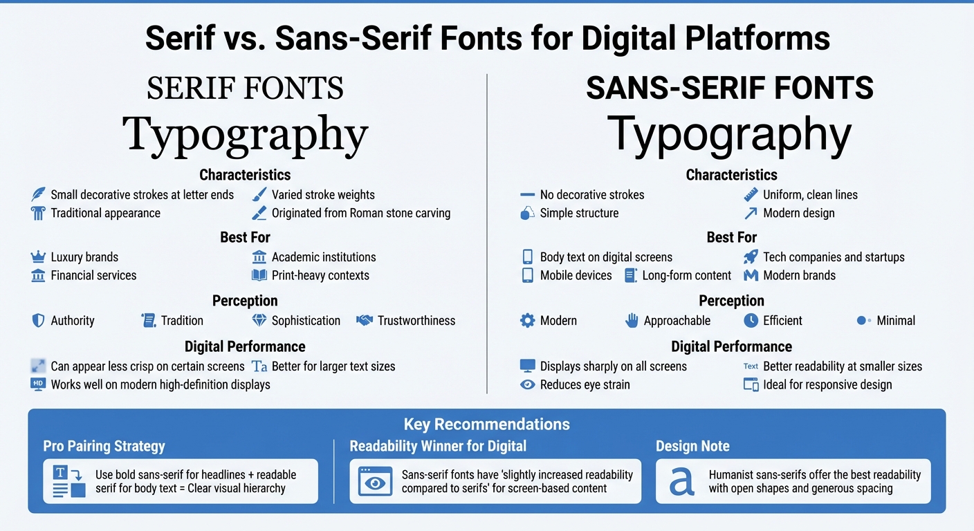
Serif vs Sans-Serif Fonts: Digital Readability Comparison
Once you’ve identified your audience and brand identity, it’s time to transform your website by picking a font category that works well on digital screens. Sans-serif fonts are often the top choice for digital content because their clean, straightforward design displays sharply, reducing eye strain. Take IKEA, for instance – they use sans-serif fonts to maintain a clear and minimal look that translates seamlessly across devices like laptops, tablets, and phones.
Serif fonts, on the other hand, have small decorative strokes at the ends of letters. These originated in ancient Roman stone carving, where artisans added finishing touches for a polished look. Serifs evoke a sense of tradition, authority, and sophistication, making them a popular choice for luxury brands or academic institutions. However, they can sometimes appear less crisp on certain screens. Fortunately, modern high-definition displays have made serif fonts a solid option for headlines and shorter text.
While sans-serifs are often seen as modern, approachable, and efficient – qualities that tech companies and startups gravitate toward – serifs are better suited for formal or print-heavy contexts. Designer Harshita Arora sums it up well:
"The Serifs and Sans-Serif work really well together. It tends to create a good design. Sans-Serif have slightly increased readability compared to Serifs."
A smart design approach is to pair a bold sans-serif font for headlines with a readable serif font for body text. This creates a clear visual hierarchy and ensures both style and functionality.
Serif vs. Sans-Serif Fonts
The key difference between serif and sans-serif fonts lies in their structure and readability. Serifs feature decorative flourishes and varied stroke weights, while sans-serifs are marked by their uniform, clean lines. For digital platforms, sans-serif fonts are typically better for body text because their simplicity translates more effectively on screens, particularly at smaller sizes.
However, not all sans-serif fonts are equally readable. Humanist sans-serifs stand out for their open shapes and generous spacing, making them easier to read than Grotesque styles. This distinction is especially important when differentiating between similar characters, like a lowercase "g" and the number "9." When selecting a sans-serif font, look for one with a tall x-height (the height of lowercase letters like "x"), as this enhances clarity on small mobile screens.
To maintain consistency and avoid overwhelming users, stick to two complementary fonts – one for headings and one for body text. Body text is usually most readable when set between 16px and 18px. Before finalizing your fonts, test them with real content at various sizes to ensure they feel natural and easy to read.
For additional flair, you can experiment with display fonts for specific design elements.
Use Display and Decorative Fonts Sparingly
Display and decorative fonts are designed to make a statement, whether the goal is to feel futuristic, elegant, or retro. These fonts work best for headlines, banners, or branding elements where visual impact is key. However, they can quickly become overwhelming if overused, especially in long paragraphs or at smaller sizes.
"Display and decorative fonts can be very eye-catching, but they can also be overwhelming if used too much. Use them in moderation to create a focal point or to add interest to a design." – I Love Typography
To strike the right balance, reserve decorative fonts for short, impactful text like titles or headings. Pair them with a clean, legible sans-serif font for the main content to maintain readability. As always, test how these fonts appear on different screen sizes – details that look great on a desktop might lose clarity on a smartphone. Adjust kerning (letter spacing) and leading (line height) as needed to optimize legibility.
Avoid using all-caps or heavy italics for long stretches of text. These styles can make it harder for users, especially those with dyslexia or visual impairments, to process the content. As design.dev aptly puts it:
"Typography should be invisible – users should read your content without noticing the typography itself."
Focus on Readability and Accessibility
Picking a font that looks stylish isn’t enough – it also needs to work well for everyone visiting your site. Typography plays a central role in web design, influencing 95% of it. According to a 2024 survey, 76% of designers now prioritize readability and accessibility over other design elements. This reflects a growing focus on creating digital spaces that everyone can navigate comfortably.
Key Features for Readability
Several technical aspects determine how well a font performs on screens. For starters, x-height – the height of lowercase letters like "x" – is crucial. A taller x-height ensures characters remain open and easy to read, particularly on smaller screens like smartphones.
Another important factor is open apertures, or the openings in letters like "c", "e", and "s." Wide apertures help prevent letters from closing up on low-resolution displays, ensuring they stay distinguishable.
Distinct letterforms also matter. Fonts like Helvetica can make lowercase "l" and uppercase "I" look nearly identical, which can confuse readers. A better option might be Atkinson Hyperlegible, a font designed by the Braille Institute in partnership with Applied Design Works. It enhances clarity by adding a tail to the "l" and serifs to the "I." This font even earned Fast Company’s Innovation by Design Award for its impact on low-vision accessibility.
Character spacing (kerning) is another key detail. Spacing should fall between 0.12em and 0.16em. Tight spacing can make letters blend together, while too much creates awkward gaps. This balance is especially helpful for users with dyslexia, as consistent spacing minimizes distractions like "rivers of space" that disrupt reading flow.
Stroke weight should fall in the medium range (400–600). Thin strokes risk disappearing on bright screens, while overly thick strokes can create visual clutter. Pair this with a line height of 1.5 to 1.7 times the font size to avoid crowded lines. Additionally, keep line length between 45 and 75 characters to make it easier for readers to track from one line to the next.
Design for Accessibility
Readability is just one piece of the puzzle – your typography also needs to meet accessibility standards. WCAG guidelines require a minimum contrast ratio of 4.5:1 for regular text and 3:1 for large text (18pt or larger). This ensures text remains visible for users with low vision or color blindness.
When setting font sizes, use relative units like rem or em instead of fixed pixels (px). Relative units allow text to scale with browser settings, which is essential for users who rely on zoom features. WCAG standards also require that text can be resized up to 200% without losing functionality or content.
Avoid using color alone to convey meaning. For instance, underline or bold links instead of just changing their color. This helps users with color blindness distinguish links more easily. Similarly, steer clear of all-caps for long passages, as uniform letter heights make word shapes harder to recognize, especially for users with cognitive disabilities.
Finally, consider fonts designed specifically for accessibility. Options like Atkinson Hyperlegible or even widely available choices like Arial (used on 23% of websites worldwide) are excellent for their clean, legible letterforms. Always test your font choices across various devices and screen sizes to ensure they remain clear and accessible for everyone.
Test and Pair Fonts
Once you’ve narrowed down your font options, it’s time to confirm that your choices work well together across various devices.
Combine Fonts That Work Together
The art of pairing fonts lies in creating intentional contrast while avoiding visual clutter. Stick to two or three typefaces at most; going beyond that can make your design feel chaotic instead of polished.
Start with the body font. As UI designer Erik D. Kennedy puts it:
"A good body font will never call attention to itself – it lets the content, the words, have center stage".
Your body text should be easy to read at smaller sizes and comfortable for extended reading. This makes it more constrained than your headline font.
Once you’ve selected your body font, choose a headline font that contrasts with it. A classic pairing might use a bold serif font for headlines and a clean sans-serif for body text. This approach keeps things visually engaging without sacrificing readability. You can also play with weight contrast. For example, pairing a heavy font like Bebas Neue for headers with a lighter, neutral font like Open Sans for body text creates what designer Toxigon describes as:
"fireworks vs. night sky" balance.
Avoid fonts that are too similar to each other. As Ellen Lupton advises:
"Too close for comfort".
If you’re unsure, superfamilies like Inter, IBM Plex, or Roboto are safe bets. These font families include multiple weights and styles designed to work seamlessly together.
After pairing your fonts, ensure they perform consistently across different devices and browsers for a cohesive design.
Test on Multiple Devices and Browsers
Once your fonts are paired, test them to ensure they maintain their appearance and functionality in diverse environments. Use at least three devices – a laptop, a smartphone, and a tablet – to check how the fonts render. Thin-stroke fonts might look elegant on a desktop monitor but can become nearly unreadable on smaller screens.
Test with real content to evaluate how styles and weights appear in practice. Experiment with various point sizes too – a font combination that looks great at 32px might lose its balance or clarity at 24px.
Perform a "squint test" by looking at your design with partially closed eyes. This helps you confirm if the visual hierarchy is clear. If headlines don’t stand out from body text, your contrast needs adjustment. Also, check how your fonts handle tricky characters like the number "1", uppercase "I", and lowercase "l." This is especially important for applications involving data, such as finance or healthcare.
For international audiences, test your fonts for character support across different languages and ensure layouts remain stable. Over 70% of global brands invest in custom fonts to achieve consistent performance across platforms.
Improve Font Loading and Performance
Once you’ve chosen the right font pairings, the next challenge is making sure they load quickly across all devices. Font files can add anywhere from 500ms to 2,000ms to your page’s load time if not optimized. Considering that 53% of mobile users leave pages that take longer than three seconds to load, optimizing fonts is crucial for retaining visitors.
By properly optimizing fonts, you can shrink their file size by 80–95%. This matters because every 100ms shaved off your load time could boost conversion rates by up to 1%. In short, faster-loading fonts can directly influence your bottom line.
Reduce Font File Sizes
To speed up font loading, start by reducing font file sizes. The best way to do this? Use the WOFF2 format. Bram Stein, author of the 2022 Web Almanac, advises:
"Use only WOFF2 and forget about everything else".
Why WOFF2? It uses Brotli compression, which offers up to 30% better compression than the older WOFF format. With over 97% of modern browsers supporting WOFF2, there’s no need to rely on outdated formats.
Next, consider subsetting your fonts. This means removing characters you don’t need. For example, if your site is in English, you can skip Cyrillic or Chinese characters. Tools like glyphhanger or pyftsubset can help strip unused glyphs. A full font file can easily include over 1,200 glyphs and weigh 140–300 KB, but a Latin subset with around 218 glyphs typically weighs just 14–18 KB.
Also, limit the number of font variations you load. Instead of loading an entire font family with multiple weights, stick to just the essentials – usually Regular and Bold. Hosting fonts yourself is another smart move. It avoids the 120–500ms connection overhead that comes with third-party CDNs. Plus, modern browsers no longer share cached fonts across different websites.
Finally, complement these steps by using web-safe and variable fonts.
Use Web-Safe and Variable Fonts
Web-safe fonts, like Arial, Times New Roman, and Georgia, don’t require any download time. They improve metrics like First Contentful Paint (FCP) and Largest Contentful Paint (LCP). Use them as fallback options in your CSS, e.g., font-family: "Custom Font", Arial, sans-serif.
Variable fonts are another great option. They combine multiple font styles into a single file, replacing 10–20 static files and reducing load size significantly. For instance, a set of static fonts might total 80 KB, while a single variable font covering the same range could weigh just 35 KB.
To prevent the Flash of Invisible Text (FOIT) – where users see blank spaces while fonts load – use the font-display: swap property in your CSS. This ensures a fallback font appears immediately. For even better performance on Core Web Vitals, consider font-display: optional, which only uses the web font if it loads instantly.
Lastly, preload your most critical fonts – typically the ones used above the fold. Add <link rel="preload" as="font" crossorigin> to your HTML <head> to start the download 200–800ms earlier. But be cautious; preloading too many fonts can compete with other vital resources for bandwidth.
These strategies can help create a smoother user experience and improve your Core Web Vitals.
Conclusion
Choosing the right fonts isn’t just about aesthetics – it directly influences how users interact with your content and perceive your brand. To make the most of your typography, focus on understanding your audience, prioritizing readability, testing how fonts perform across devices, and improving performance.
The numbers back this up. Around 38% of users leave websites with poor typography, while a whopping 73% believe typography plays a key role in a brand’s trustworthiness. To keep your design clean and effective, stick to no more than two font families, ensure body text is at least 16–18px, and maintain a contrast ratio of 4.5:1 or higher for accessibility.
Testing on different devices is crucial. Fonts can look vastly different depending on the operating system. A font that appears sharp on a desktop might lose its clarity on mobile. Try tools like the "squint test" – if your key elements don’t stand out when you squint, your hierarchy needs adjustment.
Performance matters too. Keep file sizes small and use efficient formats like WOFF2. Subsetting fonts can help, and implementing font-display: swap ensures text remains visible even while fonts are loading.
FAQs
How do I pick a font that fits my brand?
Selecting the right font begins with understanding your brand’s personality and tone. Is your brand classic and refined? A serif font might be the way to go. If it’s sleek and forward-thinking, a sans-serif font could better reflect that modern vibe.
Once you’ve narrowed down the style, consider using font pairing guides to ensure your chosen fonts work well together. Pairing fonts thoughtfully can create visual harmony and make your brand feel cohesive.
Don’t forget to document your typography choices and rules – this helps maintain consistency across all your materials. Above all, prioritize readability. Your fonts should not only look good but also communicate your brand’s identity clearly and effectively.
What makes a font accessible on screens?
A font is easy to read on screens when it is both clear and legible. This means it should have a proper balance of height, width, and thickness, avoiding overly decorative or handwritten styles. Opt for straightforward, widely recognized typefaces like Arial or Verdana, and make sure there’s a strong contrast between the text and its background. These considerations help make content more accessible, especially for individuals with low vision or reading challenges.
How can I speed up font loading on my site?
To make fonts load faster, you can use the preload directive to prioritize downloading them early in the process. Additionally, set the font-display property within your @font-face rule to manage how fonts are rendered, reducing delays in displaying text. Simplify your font choices by limiting the number of fonts and weights you use. Hosting fonts locally and choosing modern formats like WOFF2 can also make a noticeable difference in load times and overall performance.