A high-converting CTA (Call-to-Action) button grabs attention, motivates action, and removes friction. Here’s what works:
- Action-Oriented Words: Use strong verbs like "Get", "Start", or "Claim" to clearly communicate the next step. Phrases like "Get My Free Guide" outperform vague ones like "Submit."
- Clear Benefits: Highlight what users gain. For example, "Start Your Free Trial" works better than "Click Here."
- Design That Stands Out: High-contrast colors, readable text, and a button size of at least 44×44 pixels ensure visibility and usability. Red or warm hues often perform well, especially when paired with white text.
- Strategic Placement: Position CTAs above the fold for immediate actions or throughout the page to match the user’s journey.
- Urgency and Personalization: Adding urgency ("Claim Your Discount Now") or using first-person language ("Get My Free Guide") can boost conversions by over 200%.
- Accessibility: Ensure buttons are readable, keyboard-friendly, and work for all users, including those with disabilities.
Small tweaks, like using active language or optimizing button color, can drive significant results. For example, personalized CTAs perform 202% better, and urgent phrasing increases click-through rates by up to 90%. A/B testing is key to finding what resonates with your audience.
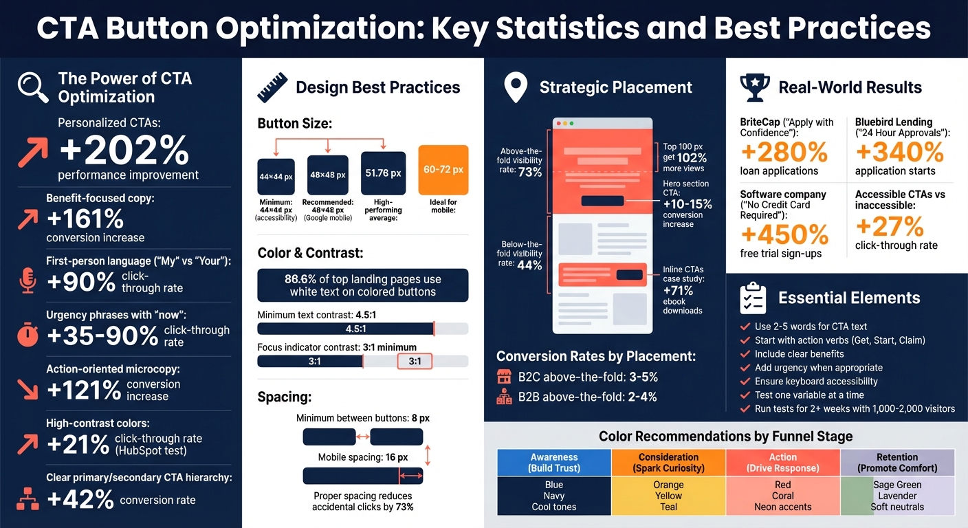
CTA Button Optimization: Key Statistics and Best Practices
7 Call to Action CTA Best Practices for Guaranteed Landing Page Conversions
Action-Oriented Language: The Power of Words
The language you use on a CTA (call-to-action) button can make the difference between a casual visitor and an engaged user. Action-oriented words act as psychological nudges, prompting users to take immediate steps. By using strong action verbs, you not only clarify the next step but also reduce decision fatigue by simplifying the process for users. Words like "Get", "Start", or "Claim" signal the action required and the benefit that follows.
The opening word of your CTA is especially important – it should be a verb that’s instantly recognizable and actionable. As Andi Coombs, Senior Marketing Manager at KlientBoost, humorously observes:
"SUBMIT is the hellspawn of terrible CTAs across the universe".
Data backs up the importance of this approach. For example, switching to active, benefit-driven wording has been shown to increase conversions by 121%. A study of 90 high-performing landing pages revealed that verbs like "Get", "Register", and "Buy" were among the most frequently used, showing their effectiveness in driving user engagement.
Using Strong Action Verbs
Action verbs deliver clarity and inspire action. Words such as "Join", "Discover", "Create", "Download", "Access", and "Reserve" encourage users to move forward. They tap into the brain’s natural drive for progress and activate the anticipation-reward cycle, making the act of clicking feel satisfying.
Specific and clear CTAs can have a huge impact, with conversion rates increasing by up to 161% when the messaging is precise. For example, instead of a vague "Submit", using a phrase like "Get My Discount" immediately communicates value. Richard Fong, Founder of Bliss Drive, explains this dynamic well:
"Action-oriented language cuts through the noise, providing a sense of direction. It speaks to the part of you that craves efficiency and clarity, encouraging you to act swiftly".
Pairing these verbs with clear benefits is where the real magic happens.
Writing Specific, Benefit-Focused Phrases
Phrases like "Start Your Free Trial" work better than generic instructions because they highlight the immediate value to the user. Instead of simply directing users, these phrases emphasize what they’ll gain. For instance, "Claim Your Discount" is far more engaging than a plain "Buy Now."
Personalization also plays a key role. Using first-person language ("My") instead of second-person ("Your") can increase click-through rates by 90%. This subtle shift taps into the endowment effect, making users feel like they already own the benefit. For example, "Get My Free Guide" feels more personal and engaging than "Get Your Free Guide".
Adding urgency can further elevate your CTA’s effectiveness. Time-sensitive phrases or the word "now" can increase click-through rates by 35% to 90%. Phrases like "Claim Your Discount Now" or "Start Today" create a sense of urgency and a fear of missing out. To maximize results, keep your CTA text short – ideally between 2–5 words – to balance clarity with immediacy.
Design Principles: Colors, Contrast, and Size
The way you design your page can either draw users to your call-to-action (CTA) or make it fade into the background. By carefully balancing color, contrast, and size, you can ensure your CTA grabs attention and encourages clicks.
Choosing High-Contrast Colors
Using high-contrast colors can make your CTA stand out, a principle rooted in the Isolation Effect (also called the Von Restorff Effect). When your CTA disrupts the visual flow of the page, it becomes more noticeable and memorable. Essentially, the goal is to create a visual "pause" that naturally guides the user’s eye.
Data backs this up. For example, in a HubSpot A/B test, red buttons outperformed green ones by 21% in click-through rates – not because red is inherently better, but because it contrasted more effectively with a green-heavy layout. Another analysis of 90 top-performing landing pages found that 86.6% of them used white text on colored CTA buttons to maximize readability.
As ColorUXLab advises:
"Your CTA color should not be your brand’s primary color".
To achieve the right balance, consider the 60-30-10 Rule: use 60% neutral tones, 30% secondary colors, and reserve 10% for your CTAs. This structure reduces mental effort for users and highlights the desired action.
Contrast isn’t just about aesthetics – it’s also critical for accessibility. The WCAG (Web Content Accessibility Guidelines) recommends a minimum contrast ratio of 4.5:1 for text, ensuring readability for users with visual impairments. According to ColorUXLab:
"Accessibility is not compliance theater – it’s profit optimization".
When users can easily see and understand your CTA, they’re more likely to trust it and click.
Modern design trends favor Coral and Warm Pink for urgency-driven CTAs, as these colors feel less harsh than pure red and look better on OLED screens. For dark mode interfaces, Neon Green, Blue, and Electric Purple are popular choices to create contrast against dark backgrounds.
| Funnel Stage | Goal | Recommended Colors |
|---|---|---|
| Awareness | Build Trust | Blue, Navy, Cool tones |
| Consideration | Spark Curiosity | Orange, Yellow, Teal |
| Action | Drive Immediate Response | Red, Coral, Neon accents |
| Retention | Promote Comfort | Sage Green, Lavender, Soft neutrals |
Beyond color, the size and shape of your button also play a huge role in making it clickable.
Optimal Button Size and Shape
While color grabs attention, the size and shape of a button confirm its usability. For accessibility, buttons should be at least 44×44 pixels, with Google suggesting 48×48 pixels for better touch accuracy on mobile devices. High-performing CTA buttons average around 51.76 pixels in height.
Rounded buttons tend to perform better than sharp-edged ones. Why? Rounded corners guide the eye inward toward the button text, while sharp edges can subconsciously signal danger, making users hesitant to click. A good rule of thumb is to set the corner radius to about 30% of the button’s height.
Spacing is another key factor. Maintain at least 8 pixels of inactive space between buttons to avoid accidental clicks, and increase this to 16 pixels for mobile designs. Proper spacing can reduce accidental clicks by 73%, while extending clickable zones beyond the visible button area can cut misclicks by up to 89%.
It’s also essential to distinguish between primary and secondary CTAs. Primary buttons should stand out with bold colors and filled designs, while secondary actions like "Cancel" or "Learn More" can use muted tones or outlines (ghost buttons). This hierarchy can boost conversion rates by 42%. However, nearly half of e-commerce sites fail to make their primary CTAs prominent enough, often skipping unique styling or clear microcopy.
Peter Lowe from Crazy Egg sums it up well:
"Clear beats clever. Obvious beats hidden".
A button that looks like a button – thanks to the right size, contrast, and shape – will always outperform designs that prioritize creativity over clarity.
Where to Place Your CTA
After nailing down the design of your CTA, the next step is figuring out where to put it for maximum impact. Placement is all about understanding how users interact with your page and what they need at each step of their journey.
Above-the-Fold Placement
The "fold" refers to the part of your webpage visible without scrolling – essentially, the first thing users see. And it’s valuable real estate. Content located in the top 100 pixels of a page gets 102% more views than anything below the fold. CTAs placed above the fold have a visibility rate of 73%, compared to just 44% for those further down.
This placement works especially well for users who are ready to act immediately, like those arriving from a paid ad or returning for another visit. For example, a CTA in the hero section can increase conversions by 10-15%. On average, above-the-fold CTAs convert at 3-5% for B2C sites and 2-4% for B2B sites.
However, the type of offer matters. If your CTA involves a straightforward, low-commitment action like "Sign Up for Free" or "Get Started", above-the-fold placement is ideal. But for more complex products, like a SaaS tool or high-ticket service, users might need more information and trust-building before they’re ready to click. For these scenarios, a well-placed CTA later in the journey can be more effective.
Including CTAs Throughout the User Journey
Not everyone is ready to act right away. That’s why placing CTAs at multiple touchpoints – beginning, middle, and end – is so important. This approach ensures you’re addressing users wherever they are in their decision-making process.
Inline CTAs, for example, can be incredibly effective. In one case study by Impactbnd.com, removing a sidebar and focusing on inline CTAs led to a 71% increase in ebook downloads. The reason? Users were more engaged with the content, and the CTA appeared at just the right moment to guide them to the next step.
End-of-page CTAs are also crucial. After a user has read through your article or scrolled down your landing page, they shouldn’t have to search for what to do next. A well-placed bottom-page CTA provides a natural next step. For mobile users, sticky footer CTAs are a game-changer – they keep the button within easy thumb reach, no matter how far they scroll, reducing friction and improving accessibility.
sbb-itb-7a4ada9
Writing Concise and Clear Copy
The words on your button can make or break a user’s decision to click. Your CTA (call-to-action) copy needs to clearly communicate the benefit of taking action. In fact, direct and clear CTAs have been shown to boost conversion rates by as much as 161%.
The key? Keep it short – stick to 2 to 5 words. Anything longer can dilute the sense of urgency and clutter mobile screens. Avoid trying to be overly clever or "cute" with your wording. Clarity always wins over cleverness. If your button reads like a legal disclaimer, users are likely to move on before even finishing it. Just like design elements guide attention, your copy should instantly highlight the value.
Highlighting the Benefit to the User
Generic CTAs like "Submit" or "Click Here" leave users guessing. And when visitors are unsure about what happens next, they often won’t click. Instead, focus on what the user will gain – turn your "call to action" into a "call to value." For example, instead of "Get Started", try something like "Plan Your Finances", or replace "Learn More" with "See How We Save You Time".
Here’s a great example: ContentVerve ran an A/B test that replaced "Start your 30-day free trial" with "Start my free 30-day trial", resulting in a 90% increase in click-through rates. That small change – using "my" instead of "your" – created a sense of ownership and made the action feel more personal and immediate.
Other companies have seen similar results by pairing benefits with reassurance or urgency. For instance:
- BriteCap used "Apply with Confidence – No Risk, No Cost" to address concerns and saw a 280% jump in loan applications.
- Bluebird Lending combined a clear action with a speed promise: "Apply Now – 24 Hour Approvals", which led to a 340% increase in application starts.
These examples prove that when you combine clarity with a clear benefit, users are far more likely to act.
Avoiding Jargon and Overcomplicated Text
Once you’ve nailed the benefit, keep the language simple. Overly complex phrasing or industry jargon can create hesitation and reduce clicks. People want to understand immediately what happens when they click, without needing to decode the message.
Here’s a comparison to illustrate this:
- "Discover Solutions" vs. "See How We Save You Time"
The second option answers the user’s core question: "What’s in it for me?".
Action-oriented microcopy – short, direct phrases that focus on what the user gets – can increase conversion rates by up to 121%. Even better, carefully chosen words can boost revenue by as much as 83%. The trick is to use active verbs like "Get", "Start", "Join", or "Download", and steer clear of anything that sounds like fine print. In the end, simple, benefit-driven text always outperforms vague or complicated alternatives.
| Vague/Complicated CTA | Clear/Simple Alternative | Why It Works |
|---|---|---|
| Submit | Get My Free Guide | Clearly states the reward |
| Click Here | Start Saving Now | Adds urgency and highlights value |
| Discover Solutions | See How We Save You Time | Explains the benefit directly |
| Begin Your Free Trial Today | Try for Free | Shorter, direct, and emphasizes no cost |
Accessibility and User Experience Best Practices
To create a high-converting CTA, you need to ensure it works for everyone. Accessibility and mobile optimization aren’t just buzzwords – they’re essential. With around 2.5 billion people worldwide relying on assistive technologies like screen readers, ignoring accessibility means losing potential customers. In fact, accessible CTAs can boost click-through rates by 27% compared to inaccessible ones. On the flip side, 41% of users with disabilities abandon online purchases due to unclear button text, leading to an estimated $2.3 billion in annual e-commerce losses from inaccessible checkouts.
Designing with accessibility in mind benefits everyone. Features that assist users with disabilities also improve usability for others, like those navigating via keyboard, dealing with screen glare, or using their phone one-handed.
Ensuring Accessibility Features
Start with the basics: use the <button> tag instead of <span> or <div> elements so screen readers can identify the button. Make sure buttons are fully usable with just a keyboard – keys like Tab, Enter, and Space should do the job. For icon-only buttons, include an aria-label or aria-describedby attribute to provide screen readers with a clear description.
Color contrast is another key factor. Button text should have a contrast ratio of at least 4.5:1 against its background (3:1 for larger text). Focus indicators should also have a contrast ratio of at least 3:1 compared to the unfocused state and be at least 2 CSS pixels thick. Avoid relying solely on color to convey meaning – combine colors with text or icons to assist users with colorblindness. Visible focus rings are also crucial for helping keyboard users track their position on the page.
Size and spacing are equally important. Design buttons to be at least 44×44 pixels to accommodate users with motor impairments. Keep at least 8 pixels of inactive space between clickable elements to reduce accidental clicks.
"Accessibility for buttons isn’t nice; they are a must if you want to reach a wider audience." – Accessibility Spark
And don’t forget: accessibility isn’t just about desktop users.
Mobile Optimization
For mobile users, accessibility fundamentals need an extra layer of attention. Thumb-friendly CTAs are a must. While the minimum size for accessibility is 44×44 pixels, 60 pixels is better, and 72 pixels is ideal for older users. One case study showed that larger, high-contrast buttons led to a 50% increase in signup conversions and a 60% rise in mobile signups.
Whitespace around CTAs helps prevent accidental taps and draws attention to the primary action. Full-width buttons are especially effective for primary actions, making them easier to reach with one hand.
Feedback is also critical. When users tap a button, provide immediate visual confirmation within 100 to 150 milliseconds to ensure responsiveness. For actions that take longer – like processing payments – use spinners or update the button text (e.g., "Saving…") to reassure users their input was received and to prevent repeated taps.
These small but impactful details make all the difference in creating a seamless and inclusive user experience.
Conclusion
Crafting a CTA button that drives clicks isn’t about luck – it’s about understanding what motivates users to take action. The key lies in combining a few essential elements: action-oriented language that spells out the benefit, eye-catching design that makes the button impossible to miss, and smart placement that aligns with natural stopping points in the user’s journey. Together, these factors, backed by data, create a winning formula for high-converting CTAs.
Consider these stats: personalized CTAs can boost performance by 202%, while benefit-focused copy increases conversions by 161%. Even small tweaks, like using high-contrast colors or enlarging buttons, can improve results by 21% and 90%, respectively. For example, in August 2025, Bluebird Lending introduced a bright blue "Apply Now" button with the promise of "24 Hour Approvals", leading to a staggering 340% jump in application starts.
That said, what works for one audience might not work for another. To find what resonates with your users, A/B testing is essential. Peter Lowe from Crazy Egg sums it up perfectly:
"Clear beats clever. Obvious beats hidden. A button that looks like a button almost always outperforms whatever avant-garde idea someone sketches on a whiteboard".
When testing, focus on one variable at a time – whether it’s the color, wording, or placement. Run each test for at least two weeks and aim for 1,000 to 2,000 visitors per variation to ensure reliable insights.
Start with the basics: use strong action verbs, make buttons highly visible with contrasting colors, and ensure they’re thumb-friendly for mobile users by designing them at least 48 pixels wide. Adding risk-reducing phrases, like "No Credit Card Required", can also work wonders. In fact, a software company in Philadelphia saw a 450% increase in free trial sign-ups in 2025 after including this simple reassurance near their CTA.
Your CTA button is more than just a design element – it’s the bridge between curiosity and action. By combining clear messaging, bold design, and data-driven adjustments, you can turn a simple button into a powerful conversion tool.
FAQs
How do I choose the best CTA color for my page?
When choosing a color for your CTA (Call-to-Action), go for something that stands out against your background while staying true to your brand’s identity. The color should also spark the emotion you want your audience to feel – whether that’s urgency, trust, or excitement.
Colors like red, green, or orange often perform well, but the key is to test what works best for your audience. Use tools like A/B testing to experiment with different options and figure out which color drives the most conversions.
What’s the best CTA text for my offer?
The most effective CTA (Call-to-Action) text is clear, action-focused, and motivates users to move forward. Phrases such as "Get Started," "Download Now," or "Sign Up Today" work well because they are short, direct, and specific. Keep your message simple and aligned with your offer to make the biggest impact.
How do I A/B test CTA buttons effectively?
To effectively test CTA buttons, try experimenting with different text, visual styles, and locations to see what drives the best results. Approach this systematically by tracking key metrics such as click-through rates or overall conversions. Use the performance data to pinpoint the most effective version and fine-tune your strategy. Careful testing and thorough analysis are essential for improving your CTA buttons and boosting conversions.